Out with the old, and in with the new!
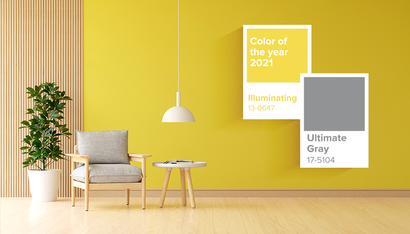
Are you someone who likes to move with the times, and update your home décor to reflect the latest trends? You might have already looked at incorporating Pantone’s chosen colour duo for 2021, Illuminating and Ultimate Grey, in your home.
But where do you start? Here’s a rundown on how you can use these colours in your home, and the wood types that will complement this inspiring colour match!
Draw attention through contrast
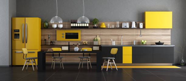
Contrast generates impact in visual elements, and this kitchen perfectly encapsulates this design principle! Here, the Pantone combo of grey and yellow are beautifully balanced against the undertones of light oak wood, with the beauty of the grains in the wood shining through.
Enduring earthy shades
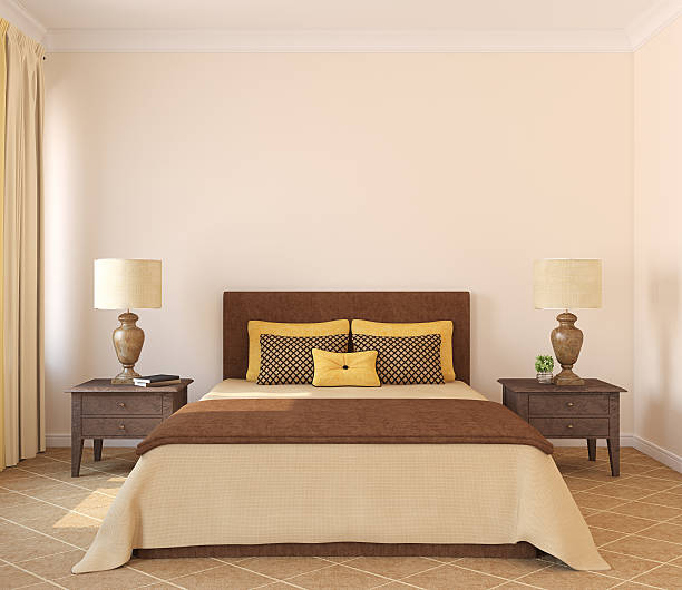
The earthy shades of dark Wenge wood come together to support and uplift the soft shades of dove grey and light ochre in this tranquil bedroom. We love the pinstripes in the pillows and bed covers that inject an element of geometry into the solid colours in the room.
Create subtle balance
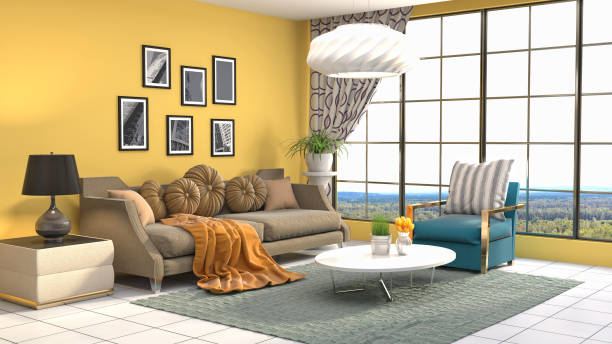
The vibrancy of the yellow accent wall is toned down by the subtle shades of the cedar wood shelf on one side of the room. Black metal legs on the wood-topped side table and the black frames on the artwork delineate and define the colour palette. Shades of grey in the velvet sofa add texture and tie the look together.
Highlight the grains
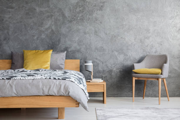
The lovely grains of the beechwood furniture hold their own against the grey and yellow palette in this calm, contemporary bedroom. The hint of blush in the beechwood complements the cool grey hues in the bed linen, while the yellow cushions add a pop of colour. The colour washed wall is imbued with a touch of silver, to add a little drama.
Opt for a distressed look
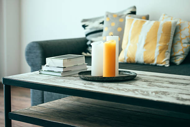
Aged, weathered wood has a rustic charm like no other. Here, the designer has used salvaged wood from a lumber yard to craft this distressed tabletop, using a chalky white finish that only gets better with time. The combination of the chalky white tabletop with the grey couch and patterned yellow cushions make the space look youthful & vibrant.
The beauty of burnished teak
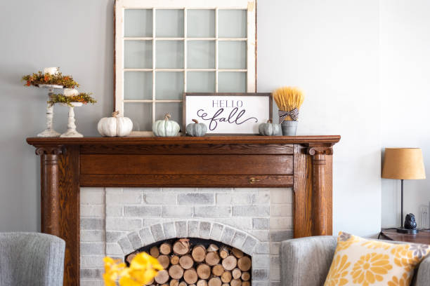
Lovely, warm natural teak has an intrinsic beauty that goes with just about anything!
While too much wood in the room can get overpowering, just one focal piece, like this mantelpiece, can create a powerful contrast against a grey and yellow palette.
Soft vibes in the nursery
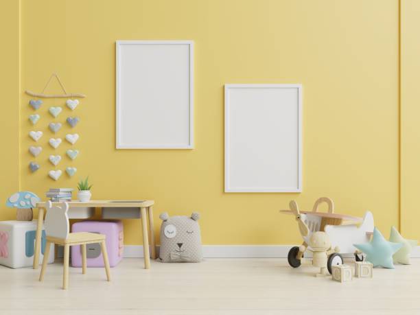
The Pantone duo has been softened and harmonized in this showcase nursery, with the two shades beautifully melting into each other in the two halves of the furniture. The wood used in the low table has been Duco painted to colour match the walls and other décor elements.
Patterns in brick
Duco painted in glossy white, the Scandinavian-style wooden centre table adds the finishing touch to the white, yellow and grey ensemble palette in this living room. The rectangular brick patterns in the accent wall and the bold stripes in the floor carpet are energising and refreshing.
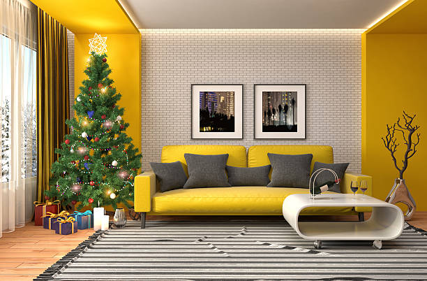
The magic of rattan
Much loved by sustainability advocates, organic furniture made of rattan’s woody stems is trending at the moment. Tabletops, chairs and lampshades made of rattan and cane lend an effortlessly cool vibe to this Pantone themed décor. Natural woody fibres like rattan, bamboo and cane look good in any décor theme and go well with any colour palette.
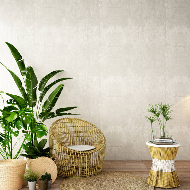
Recycled wood
Innovation is key in this eco-friendly home that showcases the best use of recycled wood! The wood from old vegetable and fruit crates has been enamel painted in white, and simply stacked or upturned to function as a table and storage units. We love the simple, chic vibe; but we love the creative use of old materials even more!
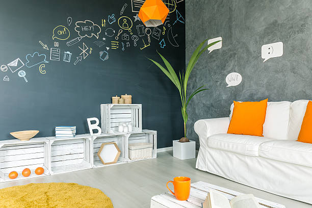
Wood and wicker
The combination of wood and wicker never fails to delight, as we can see in this modern living room with its intriguing interplay of patterns and textures. The dusky yellow accent wall is the perfect foil for the graphic grey sofa and the pretty textures of the wicker cabinetry against the wall.
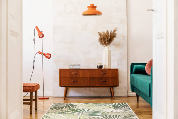
Wood is timeless and if done right, can be a great value addition to any colour palette you choose for your home. We hope you found these design tips helpful.
This article is contributed by Dipti Das, AVP-Design, HomeLane.com.
(The views expressed here are solely those of the author and do not necessarily represent or reflect the views of RoofandFloor)

