When you’re finalising the colour palette for your home office, you should pick shades that not only boost your focus but also make a personal statement. Colours have a substantial effect on your mood, and while you should go with something that you love, make sure that you also get the productivity you need for work.
Here are five shades that we recommend.
Beige
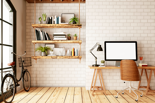
Beige is a soothing colour that brings into play the grounding energy of earth colours like brown, without the dark intensity that is typically associated with these shades. It goes well with small pops of red, black, and white.
White
White is the most natural colour to work with, given its clean appearance and purity of tone. While stark white has a clinical feel about it, you can always soften the look by mixing a hint of other colours. White is a peaceful, refreshing colour that sparks the imagination and balances and calms the mind.
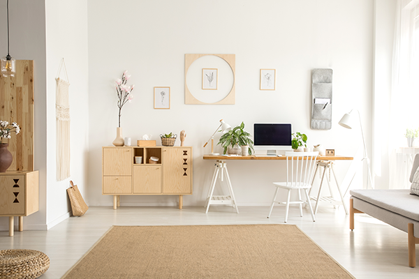
As it is a neutral shade, it combines well with any other colour in the palette. An easy way to seamlessly blend is adding a pop of colour with a throw blanket, cushion, or an indoor plant while keeping white as the primary room colour.
Also Read: 9 Best Colours for Small Rooms
Blue
Blue enhances productivity and reduces distractions. Especially when you are doing repetitive work, blue helps to sharpen the focus; probably that’s why many offices like to use aqua shades in the interiors.
Blue is a colour that expands the mind and opens new innovative possibilities at work. While pastels are more soothing, they could also make you relax a tad too much. So, take extra care to arrive at the right intensity of colour. Blue shades are complemented by green, white, and grey.
Grey
Grey is a popular colour and can look great, especially in a home office. It reduces distractions and creates a neutralising effect, helping you to work at your peak potential. All shades of grey go well with bright colours like crimson red, golden yellow, spring green, and deep blue.
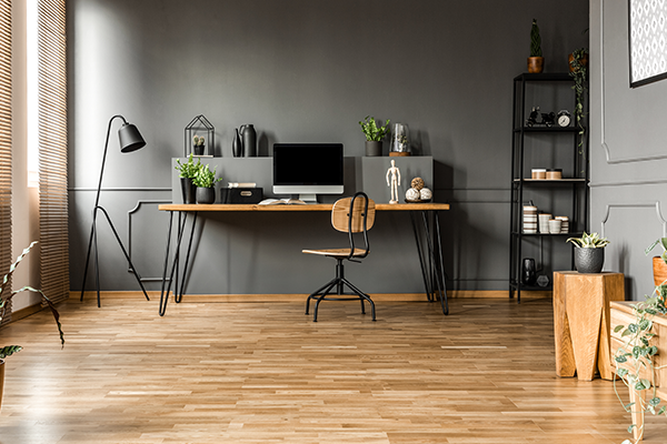
Keep in mind that some people don’t like grey as it dampens their spirits, so if that sounds like you then don’t use this colour.
Yellow
If you’re in a creative profession, then you need a little bit of colour to stoke your imagination and make the creative juices flow. Add accents of white, brown, and cream or shades on the other end of the spectrum like green.
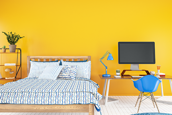
But remember that too much yellow can get uncomfortably warm and make you feel restless, especially if you are staring at this shade all day long.
Once you’ve picked your colour scheme, you should also pay attention to the intensity or saturation levels of the colours. Bold and intense shades can increase the energy to uncomfortable levels, but shades that are very insipid or watered down will cause the opposite effect and drain your energy.
This article is contributed by Dipti Das, AVP-Design, HomeLane.com.
(The views expressed here are solely those of the author and do not necessarily represent or reflect the views of RoofandFloor)

