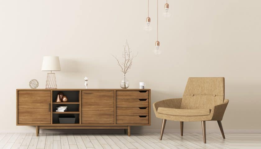
Is it possible to recreate an out-of-a-magazine look? Home décor magazines might look gorgeous, but can we afford to recreate that look in our own homes? We weren’t sure, so we decided to ask the ones who know.
Read on to find out what our experts say about the latest in this year’s home décor trends.
The case of prints

“This year is going to be the year of prints and textures,” says Parul Mittal, Director of Greenlam Industries Ltd. Prints and textures have been in trend for quite some time and continued to enchant us both with their simplicity and drama. Herringbone patterns, florals, parquet, and stripes triumph as the trendiest prints of 2018.
Explaining these, Parul says, “The herringbone pattern looks like classic ancient Roman architecture and is a great asset to those looking to add some oomph and glamour to their interiors. They are more like a broken zigzag design.”
Floral prints never go out of style. “In summers they look bright and gorgeous, while in autumn they look bold and dramatic,” adds Parul.
“Foliage print on fabric is also in trend in 2018,” says Pradeep James, Director – Design + VM, Urban Ladder.
Further, for an Indian look, opt for Ikat prints. This gorgeous fabric can be used for bed sheets, pillow covers, curtains, and just about anything else you would like.
Neetha Jagadish, a homemaker, says, “Whenever I invite guests for lunch or dinner, I never forget to take out my colourful ikat table cover and mats to add that extra zing.”
Lastly, go for prints like Paisleys or Warli for a traditional look.
Hues to choose

Ultraviolet is the Pantone colour of 2018. For the colour experts at Pantone, ultraviolet communicates originality, ingenuity, and visionary thinking that points us toward the future. For Parul, “It has the right measures of blue and red, and it adds a touch of drama to any space.”
If ultraviolet is not your colour, you can also consider passion flower, which is the Asian Paints Colour of the Year.
The comeback

It is always interesting to see classic trends making a comeback in the interior and décor space.
“Transitional look with the 70s and 80s influence on contemporary forms is making a huge comeback,” explains Pradeep.
Reiterating the same, Parul says, “After a decade of grey colours and bleached walls dominating the décor industry, there has been a huge revival of 1970s golden-age glamour in interiors. Trends from the 1960s such as metallic interiors are catching a lot of attention for all the right reasons.”
Additionally, pastel colours are no more confined to just children’s rooms or play areas. These colours are perfect to add an autumn vibe to your home décor.
Coral, fuchsia, and lavender are quite easy on the eyes and fit well with the autumn theme, bringing with them a certain freshness to the décor.
Black and white interiors, once forgotten, are also making a comeback as well.
Furniture trends

Metallic trends are not just limited to accessories anymore but have also moved to furniture pieces.
Parul says, “A white statement cabinet adorned with gold and brass linings complemented with a large decorative mirror is an excellent example of how vintage and modern align to give a gorgeous piece of furniture.”
Similarly, a marble finished geometrically-patterned centrepiece paired with dark interiors, and antique décor can work wonders for your space.
According to Pradeep, “Antique brass and new brass still dominate the warm metal look. Antique brass is a new shift though!”
Expert advice
Since patterns are in trend, don’t be afraid to combine it with other patterned accents. “A large pattern like a bold stripe looks best when combined with a smaller print. It helps create balance in the room,” suggests Parul.
Hope you have got enough inspiration to get started. Always remember the golden rule of home décor – “there are no rules!” Let your creativity flow and create a space that reflects your style and personality.


2 Comments