Think of a minimalistic home and what comes to mind is clean, white rooms that follow the ‘less is more’ mantra. But while it’s certainly true that minimalism is characterised by simple, spare lines, and pared-down styling, there’s nothing to indicate that minimalists are afraid of colour.
In fact, minimalistic décor that is anchored by layers of textures in a two-tone colour palette can make a stunning style statement. Ready to find out how to nail the minimal, dual-tone look? Read on to explore a few design tips.
The minimalistic design road map
The lesser, the better: Want to go down the minimalistic route? Start by downsizing your belongings. What you need is a fuss-free aesthetic with clean lines and plenty of open space, and you will need to de-clutter and give away whatever you don’t need.
Play with textures: Think texture, and lots of it. Faux fur throws, shag carpets, natural fibres, and wood grains against cool matte or high gloss backgrounds. You get the drift.
Minimise the accents: Your room really doesn’t need a colourful wall mural; the bare walls can do all the talking. Having said that, if something speaks to your heart, you should find a place for it in your home.
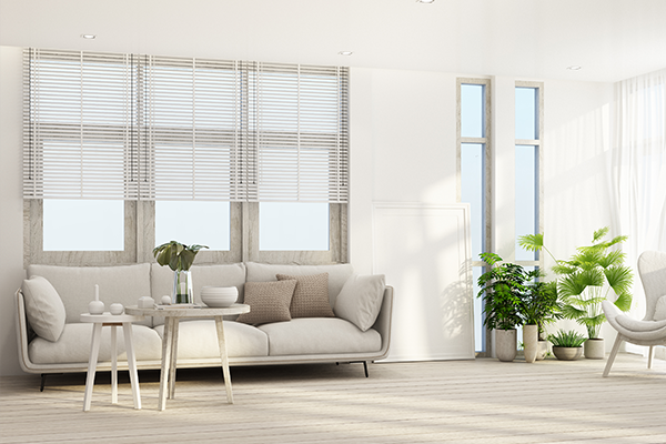
Go natural: Keep the finishes real. If you’re using wood, let the grains shine instead of hiding them with paint or varnish. Bamboo, jute, or linen should be left unadorned to showcase their innate beauty.
Open up the room: The furnishings you choose should open up the room, not clutter it up. Use mirrors to enhance the space and try to keep the windows bare.
Focus on functionality: In minimalistic décor, beauty comes from paying attention to functionality. The principle of ‘form follows function’ should hold good for every piece of furniture you pick.
Geometry rules: Especially if you are trying to get an industrial aesthetic, the elements in the room should have clearly defined shapes and sharp lines.
Emphasise negative space: A minimalistic interior needs to breathe. Leave as much open space as possible between furniture and celebrate negative spaces, voids and emptiness.
Go easy on colours: Soft neutrals with only a hint of colour give a cool, calm and relaxing air to these spaces. This décor theme does not normally use bold colours, and even if it does then the brightness is toned down by a calming backdrop. Minimal themes lean toward monochrome palettes, but if that sounds a bit boring for you then we’ve put together some refreshing dual-tone décor ideas to inspire you.
Dual Tone Look Book
#1: Yin and yang
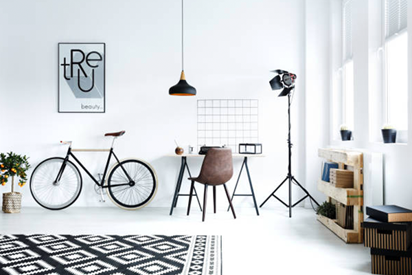
You just can’t go wrong with this classic palette; the black and white décor is contrast at its finest. In the living room below, the walls merge seamlessly into the flooring tiles, with the black décor accents standing out in vivid contrast to the pristine white of the rest of the room.
#2: Cool grey meets warm tangerine
The warm, fuzzy tangerine of autumn pumpkins makes for an unlikely pairing with soft dove grey; but as you can see it’s a match made in heaven. This combination is sophisticated and edgy at the same time. Note how the designer has skilfully woven pattern and texture into the frame.
#3: Breezy and sharp, blue and white
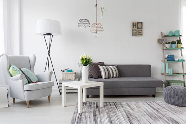
When calm, peaceful white meets the soulful depths of ocean blue, you get the ultimate soothing, refreshing space. This modern living room takes its colour cues from the Chinese vase in the background, exploring various shades of this classic pairing that has stood the test of time.
#4: The vibrancy of living coral
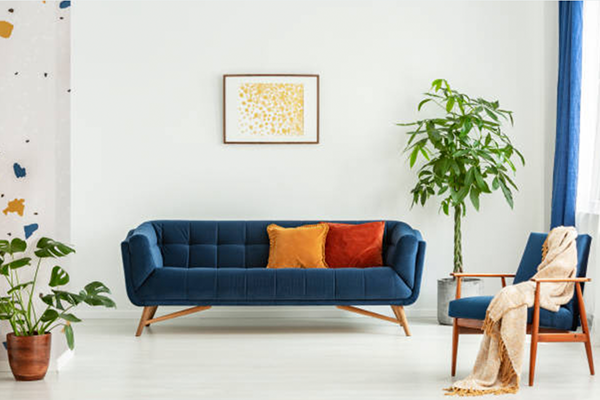
The warm dynamic of coral ties up beautifully with the soft neutral backdrop of the palest grey underfoot. The lush tropical overtones of coral are exotic and energising and create a glowing hue that flatters any space.
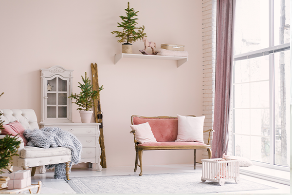
#5: Red accents on grey
Vibrant red injects a dose of zesty personality into the softness of cloudy grey in this modern minimalistic interior. It’s important to get the balance right; too much red will overpower the room, but too little will not make enough impact.
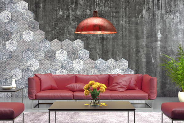
#6: Nature-inspired combo
There’s nothing quite as refreshing as shades of green. This nature-inspired combo is evocative of the earthy shades in a verdant rainforest. The jewel tones of emerald green spill over into the dining chairs and the sofa in the living room as well, and are echoed in the vibrant green of the bicycle leaning against one wall.
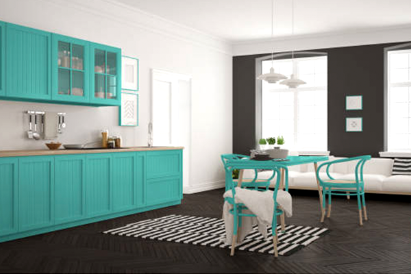
So, what are you waiting for? Go ahead, explore these minimal dual-tone design tips and create a home that is both trendy and functional!
This article is contributed by Dipti Das, AVP-Design, HomeLane.com.
(The views expressed here are solely those of the author and do not necessarily represent or reflect the views of RoofandFloor)

Very nice