“We simplify your home buying journey,” scream most of our marketing collaterals. Yet, this is anything but a straight-forward process. Providing optimum user experience to the retail market is always an uphill battle, and real estate selling brings its own unique challenges to the table.
The secret sauce is in building a fluid, learnable solution that adapts to the users’ specific needs and seamlessly delivers exactly what they are looking for. And this is always easier said than done.
User experience is normally understood as colour schemes and page layouts, and in better cases as user interfaces and navigation flow. While this is all true, everything that the users interact with contributes to — and mostly hampers — their experience of the product or service.
 In the case of RoofandFloor, like most leading property portals, our end-users interact with us in a variety of ways: be it our website, mobile app, emails, phone calls, texts, and of course, in person with our home buying advisors.
The real challenge is in designing and implementing a standardised interaction protocol, that is, in essence, user-friendly and perceived as easy-to-use. And this is what we have been hard at work these six months: to provide a single, unified experience across all customer touchpoints and positively impact our users’ experience of our services.
The primary challenge is not even user interfaces, but the element of trust or the lack of it. Since home buying is mostly the purchase of a lifetime, it is not one of the easier things to sell online. This automatically makes most people look at our offerings only as property listings, a Yellow Pages for property if you will.
Next up is the fear of brokers. Owing to long-term, negative experiences of working with brokers, people are wary of getting into any dealings with property portals. We have to put in that extra effort to convince our users that we are not brokers, nor is our portal just another way of dealing with brokers. We are a platform that lets people look up various properties, helps shortlist those that they like, and enables direct interaction between them and the respective builders.
The crux, of course, is in understanding the needs of homebuyers, accounting for the user’s unique behavioural traits and fancies, and designing an application or service that provides exactly what they are looking for – in the way they want.
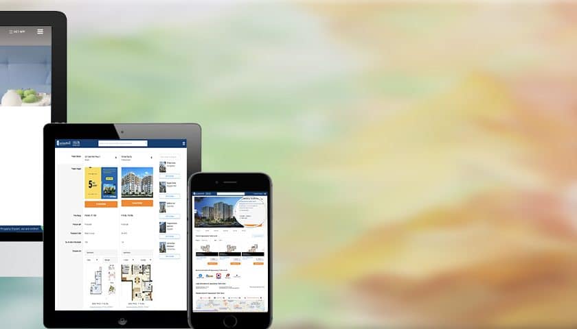
To help achieve these goals, we have been busy revamping our product and our services from ground-up: reimagining the interactions, redesigning the interfaces, and of course modernising our look and feel. Our users are now assured the same rich experience whether they use our portal on large screens or smartphones. Similar major improvements are coming to our mobile app too.
Alongside these design changes to improve usability and user experience, we have also been upgrading our technological capabilities, adding new product features, improving our communications, and up-skilling our home experts.
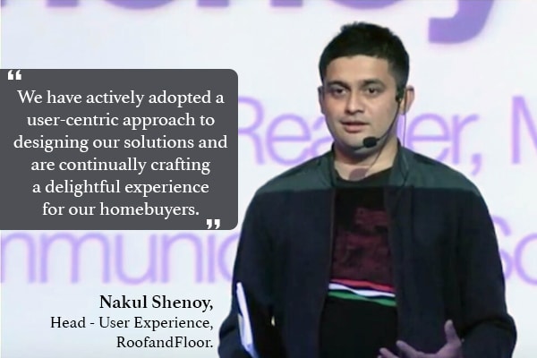
We have actively adopted a user-centric approach to designing our solutions and are continually crafting a delightful experience for our homebuyers. The various facets of the service working together cohesively are what makes this effort fruitful and the result impactful.
We believe our journey in wowing our clients with a trademark rich and easy experience has just begun, and we will not rest until we have made their home buying process simple and intuitive. These are exciting times at RoofandFloor, and I look forward to telling you more soon.
This article is contributed by Nakul Shenoy.
Nakul leads the User Experience initiatives at RoofandFloor. An accomplished design researcher, he holds two Ux patents, is a HarperCollins author and a leading corporate speaker, and tweets as @NakulShenoy.

