You are out apartment hunting. You enter a model flat, and you are so impressed that you want your house to be ‘just like that.’ How many of us are familiar with this scenario? Maybe all of us.
Model flats always have a storybook perfection about them. They look pristine, coordinated and lived in without being messy. Why don’t our homes appear like one? Where are we going wrong?
Here are our expert in-house tips on what you can learn from model flats and key mistakes to avoid.
Mistake #1: Decorating room by room
When you buy a new house, you are mostly on a tight budget. The scope for decorating the entire place at once seems like a daunting prospect. So what do you do? Decorate room by room because it is lighter on the wallet and also reduces the sensory overload that comes with picking themes and colours. But it’s not the best thing for your home as the ultimate result can appear jumbled.
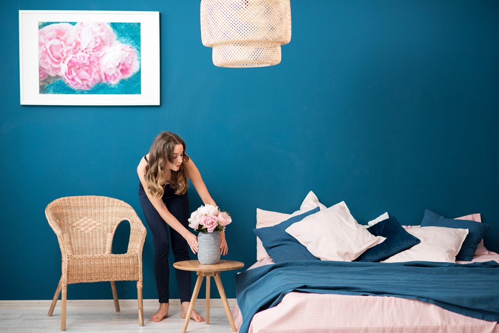
What professionals do: Create a plan for the entire home. Note that we are not saying “decorate” your entire home. Having a plan in place will help you match elements, colours, and other essential aspects to create a smooth flow across all rooms. Once you have a plan in place, all you need to do is stick to it while continuing to stagger the decorating and furnishing process.
Mistake #2: Opting for a broad palette
It is exciting to play ‘dress-up’ for your brand new home. In your eagerness, you might end up picking different colours for each room to make it distinctive. However, this can result in a perplexed and uncoordinated look that might be disappointing in the end.
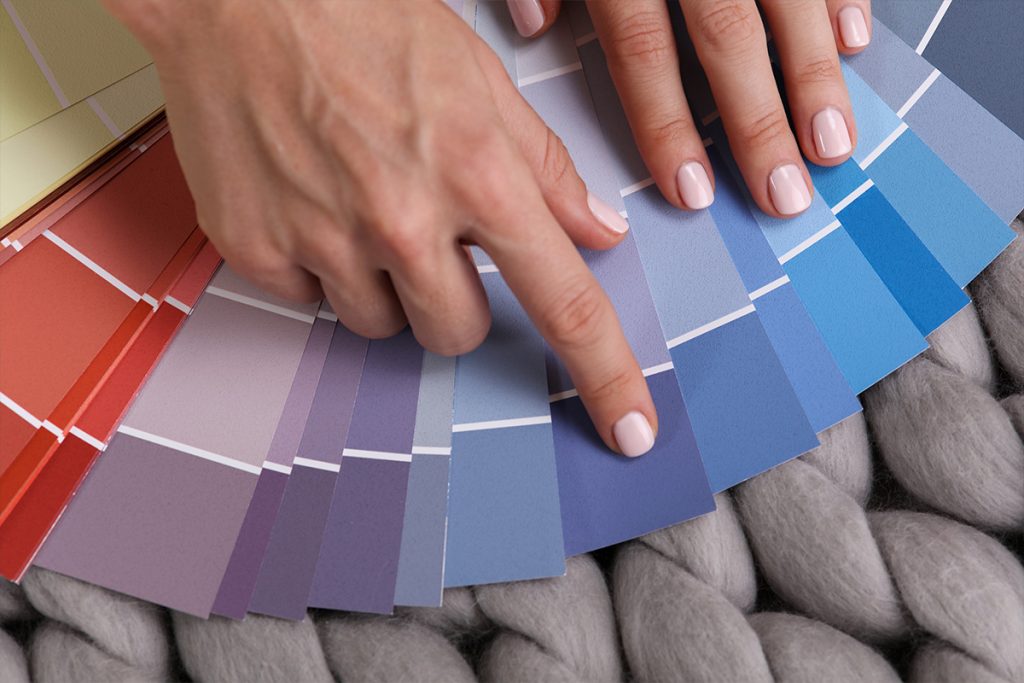
What professionals do: Start by picking a colour for the largest room, which can also be seen from other parts of the house. Most often, this is the living room or the kitchen. Pick different or similar shades of the same colour that you have chosen for the remaining rooms. If you have an open plan that enables the eye to see more portions of the house, then it’s best to avoid colours that clash.
Soft neutrals, whites, and other light shades can be teamed up to create a beautiful gradient that makes your house pop with great depth and tone. Interleave them with some bold colours too but keep the primary colours consistent.
Mistake #3: Mixing up furnishing and designs
Usually, the kitchen and dining, and the living room areas get most of the limelight when it comes to furnishing. After all, these are the places that guests see the most. But how much attention do you pay to make patterns and to furnish consistent across the house? Not much. Mixing patterns and furnishing to get the right effect is slightly tricky. But a little effort goes a long way in transforming your home.
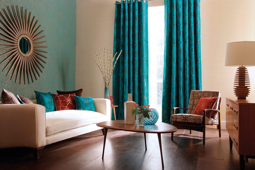
What professionals do: Designers begin by choosing one element of consistency. Want some explosive colour for the living room sofa? Choose different colours for the cushions but keep the same circles or polka dots or any other patterns the same. The scale is significant too. Cushions of the same pattern and colour will look great but will look extremely odd if they were of varying sizes. Make sure you also keep the overall colour palette of the house in mind while picking out patterns, textures, and fabric.
Mistake #4: Having different flooring in each room
Tiles for the kitchen, wood for the living room, laminate in the bedrooms, and terracotta for the patio sounds perfect to you, right? Wrong. Choosing floor types based on the footfall and usage is good, but if you don’t keep the material and colours consistent, it will result in dizzying disarray.
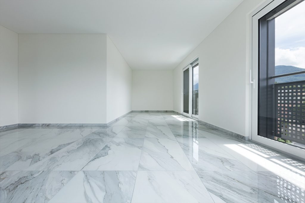
What professionals do: It all boils down to the colours again. Although it does help if you can manage to restrict the types of flooring to one or two, it is not necessary. It is the colour that makes a difference. For example, if you are going with light colours in the living room, follow the same in all rooms. Sure, you can add a richly hued wine-red rug to the living room. Or a dark grey carpet for the stairs. But it should be in tandem with the other colours that are present across the house.
Mistake #5: Designing rooms in multiple styles
Scandi style for the living room. A countryside look for the kitchen. A lived-in look for the bedroom. You love all of these styles, and you want to experience all of them in your home, but, sadly, they are not cohesive.
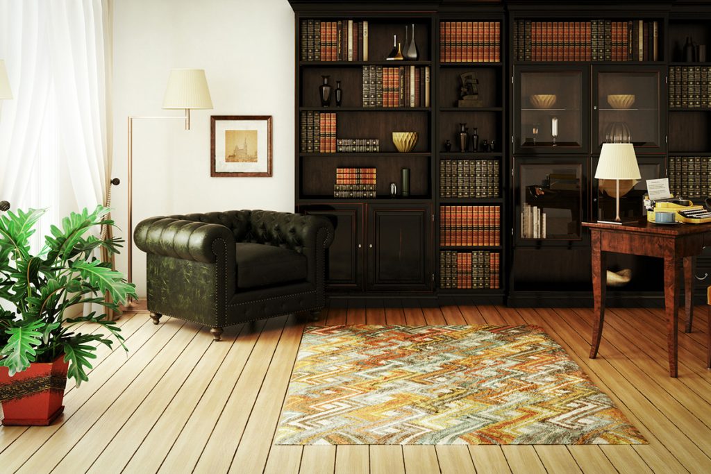
What professionals do: Read more about each of these styles and pick the one that appeals to you the most. If a rustic setting is what you like predominantly, then try to maintain the same look across your home. Prefer the minimalist Scandi style? Do up your home in clean lines and spartan spaces with contemporary fabric in pale but inviting colours. Mix and match furniture styles carefully as well, so that it blends in with the rest of the house.


Thank you so much for sharing the valuable post.