
Contrasting elements always make a bold impact, and designers use this principle to their advantage to make interior spaces stand out. By introducing carefully curated contrast pieces in a room, you can grab attention, establish the hierarchy of elements and make a statement.
How can you create a stunning first impression through contrast pieces in your home? Here’s a design primer to help you pull it all together!
Pick a standout colour
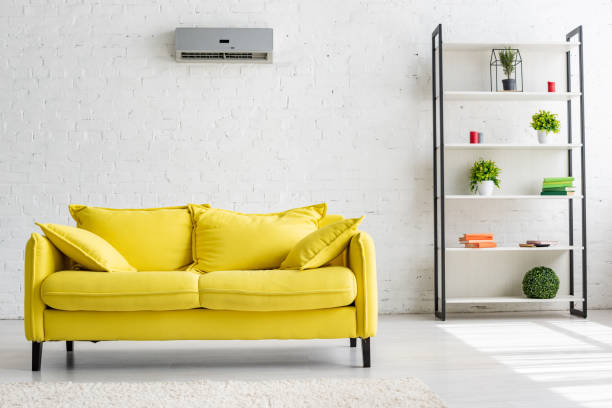
Strong impact can be created by using colours on opposite ends of the spectrum or through a single high contrast piece of furniture in a vibrant hue. In this living room, the funky yellow sofa is what makes all the difference! It grabs eyeballs and elevates the visuals of the room, forcing the rest of the space with its pleasantly neutral décor to completely pale in comparison.
Play with metallics
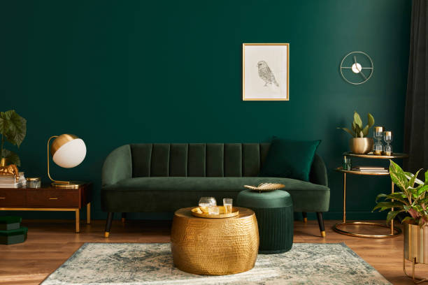
Metallic shades are a surefire way of introducing contrast, as we can see in this stylish living room. The deep saturated tones of green in the walls, velvet couch and pouffes are brought into brilliant contrast against the gleaming brass coffee table that makes a statement unlike any other! The metallic accents are carried through in the plant holders, the pretty little table in the corner and the oversized lamp to one side. Again, the lone picture on the wall adds visual relief through secondary contrast.
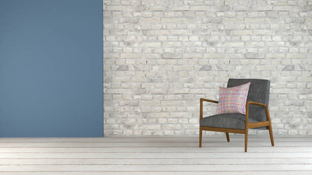
Create contrast through furniture style
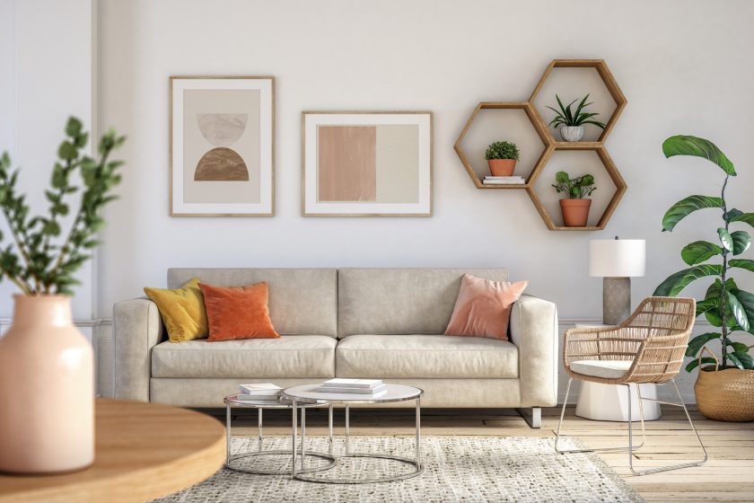
There are times when just a single unique piece of furniture—like this vibrant chair with its one-of-a-kind design—really makes a statement.
Put together elements with contrasting textures
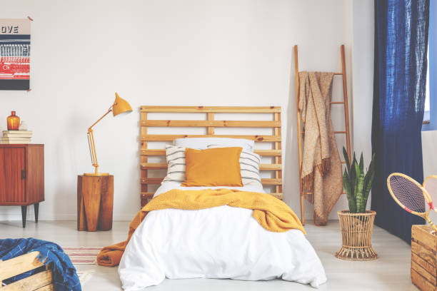
While there is no single standout piece that creates contrast in this lovely ethnic bedroom, there’s plenty of contrast offered up in the textures all around. The rough fibres in the handloom fabrics on the bed, the natural weaves in the straw hat collection against the rough plastered wall and the motifs in the cane chair, together serve up an abundance of textures and patterns that create visual contrast.
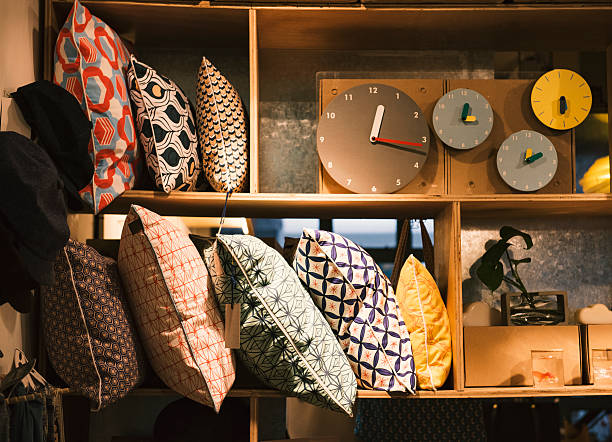
Mix materials to create contrast
Just something as simple as a colour blocked raw silk cushion that picks out the primary shade in a bunch of patterned cushions can create contrast through the use of different materials. The silken sheen of the blue cushion in the indicative image below creates a luxe pairing with the pretty floral patterned cushions on either side. Pile them up on a couch fitted with simple white slipcovers for a look of understated elegance.
Look for contrasting shapes
Especially in children’s rooms, playing around with shapes is a creative way to create playful contrast and capture the interest of young minds. This vibrant kiddie playroom gets it just right, with the colourful interplay of square and round shapes. The simple flower-shaped mural on the wall is also sure to make your little ones squeal with delight. We love the polka-dotted curtains and all the bold colours in use.
Add a vintage touch
Are you overly attached to a delightful chair or a lovely little side table with carved legs that dates back to your grandfather’s time? Even if the rest of your home décor is modern, give this one piece of furniture pride of place. It doesn’t have to fit in or match, and that makes it all the more special! If you are wary of having it stick out like a sore thumb, you can consider trying the look together with similar patterns in the upholstery.
Keep these tips in mind:
- Too many contrasting elements in a room will make unnecessary noise. One single piece that offers high contrast is always more impactful.
- A neutral background with toned-down colours and materials will allow the statement piece to take centre stage.
- Have a neglected corner that looks lost and forlorn? You can add a contrasting element and draw attention to it through the right lighting.
- If you are using contrasting colours throughout the room, not just in one statement piece, ensure that one colour plays a dominant role while the other is used as the accent. Giving equal importance to two strong shades can result in a lack of visual balance.
- Some suggestions for unusual colour pairs: Taupe and deep mauve, cobalt blue and vivid pink, teal and burgundy, or tangerine and beige. Try them in your home!
Contrast is a secret weapon in an interior designer’s arsenal, with the capacity to elevate the look of an otherwise ordinary room in an instant. Clever designers can use it in the right places and to good measure to create a lasting impression. Would you like to use the magic of contrast in your home? Let us know in the comments!
This article is contributed by Dipti Das, VP-Design, HomeLane.com.
(The views expressed here are solely those of the author and do not necessarily represent or reflect the views of RoofandFloor)