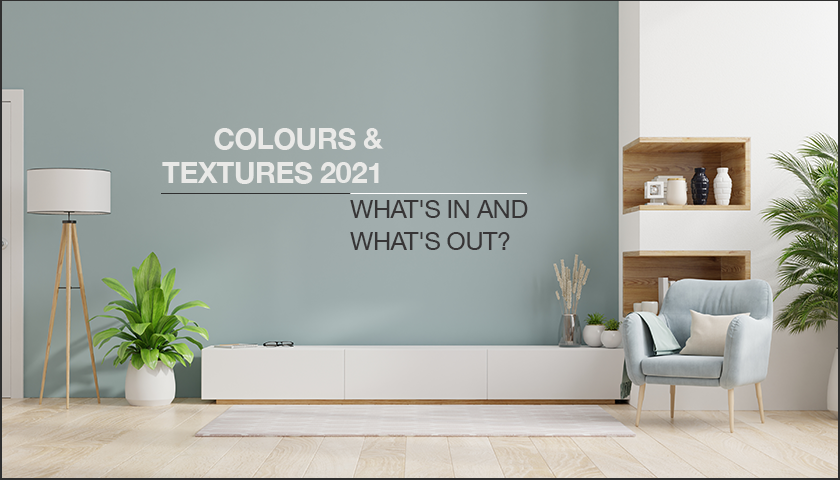
For most of us, it seemed that 2020 would never end! Now that it has, it’s time to brush off the remnants of the past year, and put together the interior design trends that are expected to be in vogue in 2021.
In this post, let’s take a look at how you can curate colours and textures that will make your home décor the talk of the town in the New Year. Find out what’s in and what’s out, and reinvent your home décor for 2021.
What’s in?
Colours of the earth
Colour experts have zeroed in on warm, elemental shades this year. Their designated colour of the year is Brave Ground, an earthy shade that their design experts believe will help us to adapt to change, underlining the need for smart and sustainable solutions for the future. This warm neutral reconnects us with the colours of the earth and can be used in a multitude of combinations.
Shades of nature
When decorating with earthy shades, can green hues be far behind? Take your cue from nature and bring home this colour duo that has stood the test of time. Whether you use brown or green as the main colour and the other to accessorise, this combination never fails to refresh and restore our connection with the earth. Combine deep chocolate and spring green, or celery green and taupe to make a lasting impact.
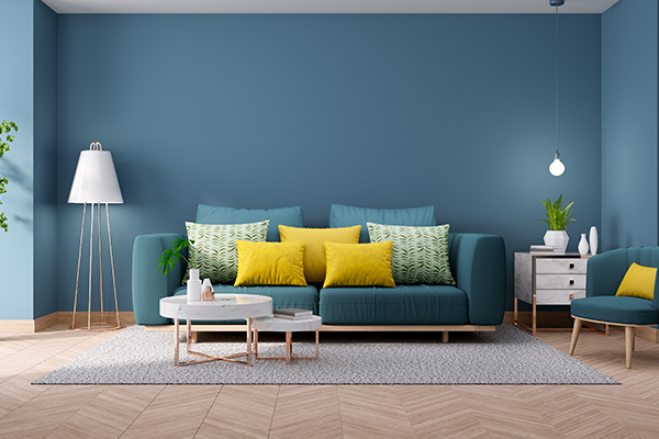
Ocean blues
Shades of blue complete the colour triad, and are also expected to be in vogue this year. Blues capture the expansive vastness of the ocean and the endless sky above and transform any room into an oasis of tranquillity. After the unpredictability of the past year, all we need is to settle down to some calm and quiet times this year.
Mix and match shades of aqua, teal and powder blue with the grey of overcast skies for a cool, restful palette.
Pantone’s marriage of colours
If there’s anything that 2020 has taught us, it’s that there is always light at the end of a dark tunnel. And that’s what Pantone’s colours of the year seem to signify! Ultimate Gray is offset by Illuminating, a sunny and friendly shade of yellow. As we look to overcome the bleak uncertainties of the year gone by, we strengthen ourselves with the warmth of optimism for good times ahead.
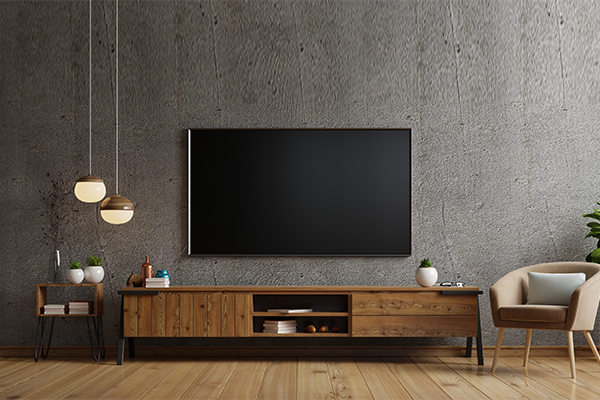
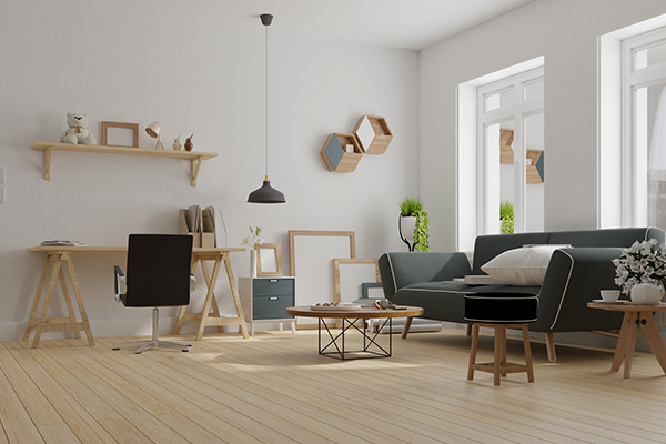
Warm, natural textures
Sustainability is at the core of design practices this year, and interior designers will be looking to use products and services that reduce negative impacts on people and the planet. Organic textures and raw, unfinished materials will be key to achieving this sensibility. This means that grainy wood finishes, jute, rattan and other natural textures will be sought after.
Look out for warm terracotta flooring, exposed brick and rough stone finishes that lend character and earthen appeal to your home décor.
What’s out?
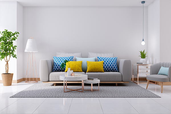
Whites and pastels
The all-white aesthetic has lost its shine, after a long run in our décor look book! In 2021, the emphasis will be on bright, vibrant palettes and earthy colour palettes. Pastel shades, too, have started to look dated and should be avoided. Get the look with bold patterns; chevron stripes, checks and geometric prints will all take centre stage.
Metallic finishes
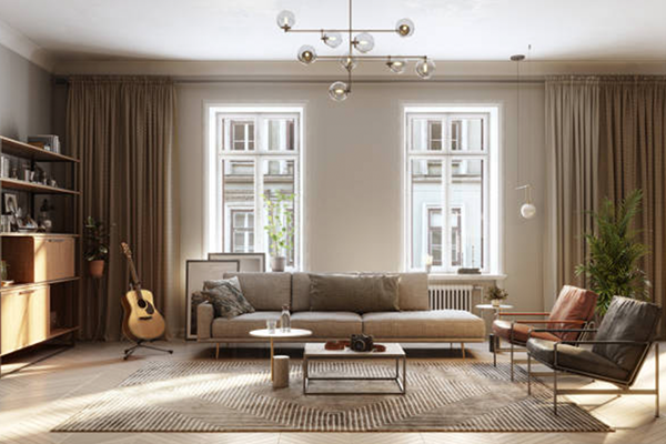
The emphasis on metallic finishes that was all the rage in the past decade has also moved on. Industrial décor is not the preferred trend anymore, and designers are now leaning toward raw finishes and rustic styling.
High gloss cabinetry
A revival of old fashioned styles and vintage themes is long overdue, which means that high gloss or acrylic finishes are on their way out. Warm finishes in wood, rattan and wicker will dominate the décor scene.
Traditional styles are considered to be comforting and predictable, and people are now seeking antique patinas and worn textures rather than modern gloss and shine.
This article is contributed by Dipti Das, AVP-Design, HomeLane.com.
(The views expressed here are solely those of the author and do not necessarily represent or reflect the views of RoofandFloor)